If you’re “in learning” like I am then you probably have to take these nerve shattering things they call “tests”. And if there’s anything I know about them, it’s that they suck. But there are a few ways you can prepare for these kinds of tests.
Videos
There are numerous types of videos for you to use for testing. Watch the tutorials on sites like, Linkedin learning, or the sites youtubers keep promoting like skillshare, or you can even look up youtube videos that teach you how to do things if whatever the schools provide aren’t working.
Practicing
Practice doing the the stuff you see them do. Don’t just watch the videos in the hopes that you’ll understand it, because they aren’t that simple. They’re really not. Just watch and do the stuff after or while you watch it. The term practice makes perfect exists for a reason.
There really isn’t much no know about how to study for this kind of test because you really need to just practice the stuff that they’re going to test you on. I do this alot and I passed the certification test easily. Now I did do this before so photoshop wasn’t hard for me to certify in, but this is the best way for you to study for this.
Let’s talk about Brand guides for a moment. According to 99designs.com what a brand guide (brand styled guide) is a rule set that explains how an organization is supposed to present itself. From how it’s supposed to be to what it’s not supposed to be, in terms of logos, colors, titles, fonts, photography, and even mission. The brand guide is THE guide as to how-to-brand the right way, because without it the brand has no identity. No guide, no direction, hence why it’s called a brand GUIDE.
How to brand guide
There are a few key components to a brand guide.
Mission/vision: This mission is why your company exists and the vision statement to where you want the company to go.
Target audience: Who do you want to attract? Who are the customers and why do they need you? And what can your brand do to solve their problems? This is what your brand has to do for your audience. Note this: remember, it can’t please everyone so make it so that you can please as many as you can.
Personality: Describe your brand. 99designs.com suggests to try listing three to five adjectives describing what it is. (And to also list what it is not.)
Core values: What are the guiding principles for your teams decisions and actions. Make it memorable so your team can stay on brand easily.
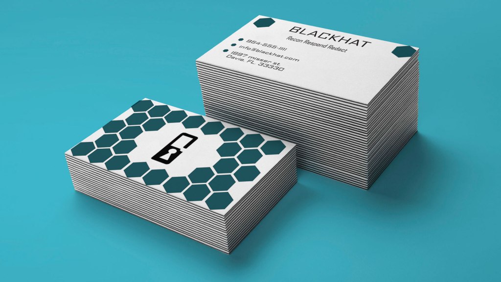
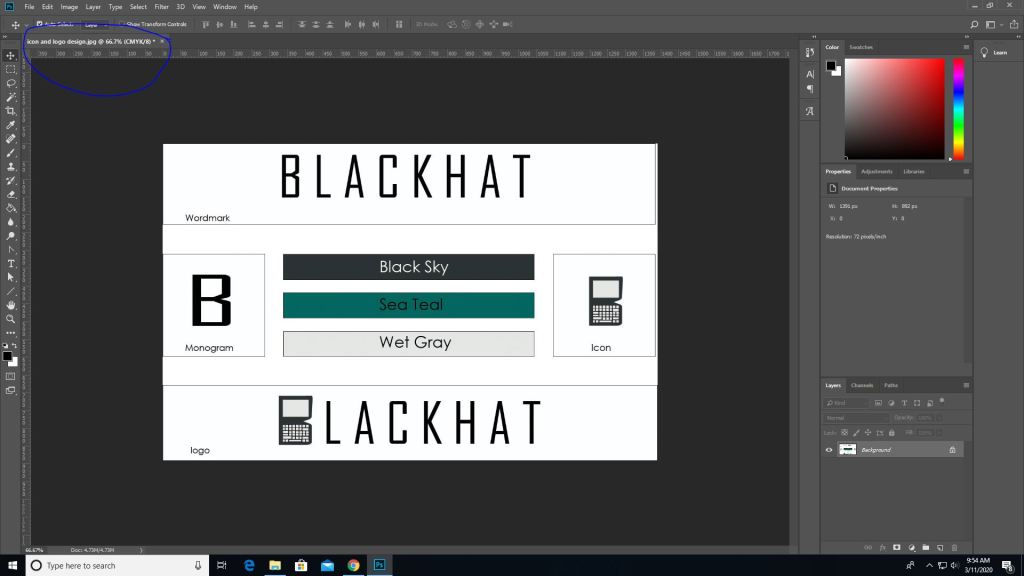
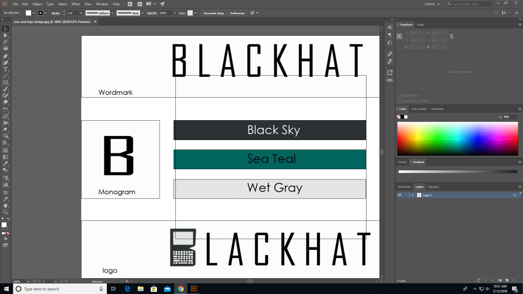
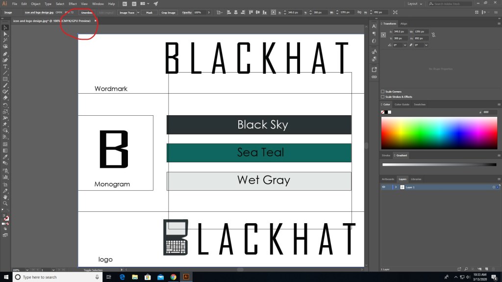
The logo for my company
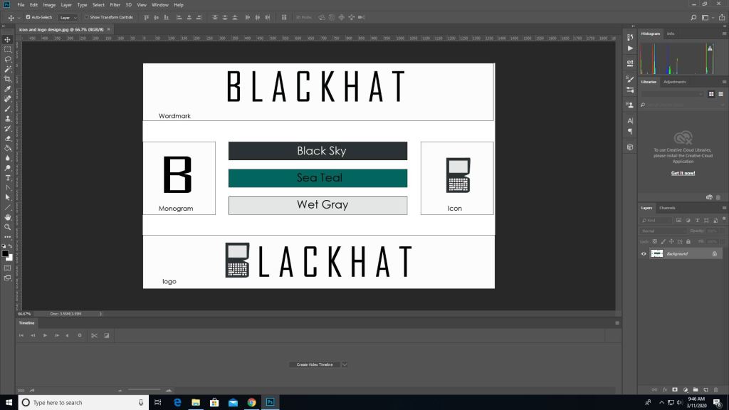
When I was doing a brand guide I included the colors and title and logos and ect. The design for this involves the wordmark being made out of the agency FB type font, and the “B” in blackhat to look like a lock to symbolize the security that our company provides.
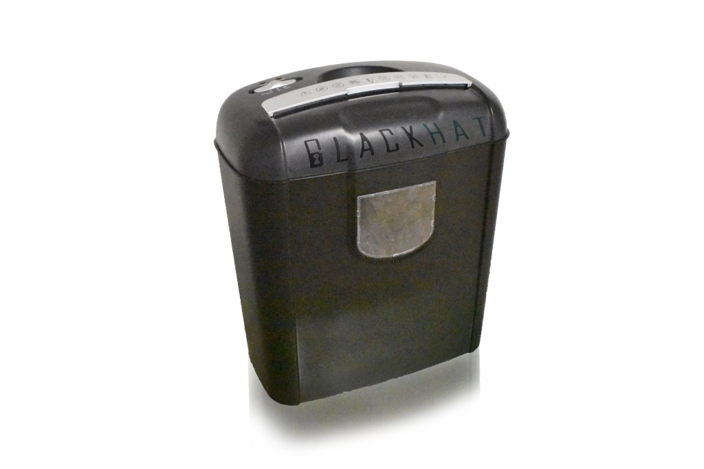
Have a document shredder to dispose of documents (made with photoshop)
The best tool for designing mockups would be illustrator for designing logos and photoshop for editing any photography for your company. Though I have to say using illustrator was hard for me because I’m more of a stranger to it than photoshop, but once I actually knew what the hell I was doing, I managed to get it. It’s all a matter of getting your foothold and then once you start, there will always be the finish line.
So now that you know how to brand guide, and now that you know how to brand guide there should be nothing standing your way to make your company flourish.
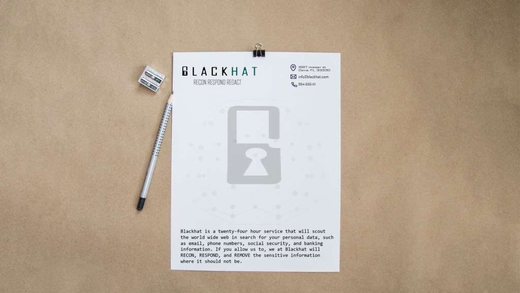
letterhead mockup made in illustrator, edited in photoshop.
Now we’re gonna go deep into InDesign. Lets learn about some really good tools and even learn about new things about new extensions.
Pre-Flight
Preflight checklist
Pre-Flight is the ritualistic inspection you absolutely must perform to ensure that your aircraft is airworthy. This includes checking the air pressure gauges, manifold pressure gauges, pitot head check the ailerons, and sump the fuel.
But we’re not talking about that preflight. Preflight for indesign involves performing quality checks for documents before handing them off to clients. The preflight panel warns you of any problems that can prevent a document or book from printing or outputting as desired, whether it is overset text, missing files of any kind, or low resolution images. To use the preflight first go to the windows panel -> then output -> then preflight, if the icon is green then no errors should be detected, if its red then there are.
Cover/poster designing
In the modern days ebooks are now being read instead of print (print still exists of course). In design can be used to create covers for books, posters and newspapers.
EPUB
For ebooks the file extension it uses is the epub format which is used to package content for ebooks carrying the necessary files and images and is more supported than PDF files.
Tools
Some tools to keep note of are the text tool, which is exactly what you think it is. You use it to add text to your covers. The hand tool which as you can guess move the artboard around. The shape tools, which if you know anything about illustrator you can build shapes for your designs. The pen tool which draws shapes just like in illustrator as well. And the scissors tool which can cut lines into new segments. These are tools that greatly help you when using indesign.
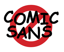
When it comes to fonts there are many different types than just Ariel, Times New Roman, and…
From mytimes.com
We ain’t using this anymore. Don’t use this. EVER. There is nothing less professional than comic sans. So we’re going to talk about fonts and how to do them right.
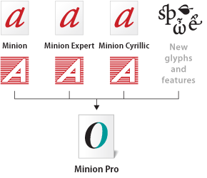
Open Type Fonts
from adobe.com
Open type fonts are cross platform font file formats that were developed by adobe and microsoft. The main benefits of open type fonts are it’s cross-platform compatibility (so they can work on both mac and windows pcs), and its ability to support widely expanded character sets and layout features, which provide richer linguistic support and advanced typographic control. Feature-rich adobe open-type fonts can be distinguished by the word “pro”, which is a part of the font name. Open type fonts can be installed and used alongside Postscript Type 1 and TrueType fonts.
Open type fonts significantly simplifies font management and the publishing workflow by ensuring that all of the required glyphs for a document are contained in one cross-platform font file throughout the workflow. Open-type fonts may contain more than 65,000 glyphs, which allow a single font file to contain many non-standard glyphs, such as old-style figures, true small capitals, fractions, swatches, superiors, inferiors, titling letters, contextual, and stylistic alternates, and full range of ligatures.
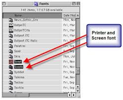
Postscript Fonts
from: fonts.com
Postscript fonts are generally two main components to Postscript Typefaces. The first file contains the actual Post script typeface itself and is often called the “binary” or “printer file” file. The second file contains the typeface’s complete name, the spacing characteristics and information to help the computer display the typeface on the screen and for printing the font. Both files need to be submitted.
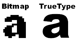
Truetype Fonts
from: computer.howstuffworks.com
Truetype fonts only require one file to be submitted for each instance of the font. For example, a different file is needed for normal, bold, italic, etc. Truetype typefaces are generally intended for business office use and can be less reliable for publishing applications. Only use Truetype typefaces when the typeface is unavailable in Postscript format.
And now you know a little more about fonts, and how they work. Now go type a good story and remember, DONT USE COMIC SANS.
When it comes to making gifs (not pronounced JIFFs), it’s a bit more complicated than taking a picture, or just drawing a picture. Because in animation it’s really about multiple pictures with objects in multiple positions.
I used photoshop for this.
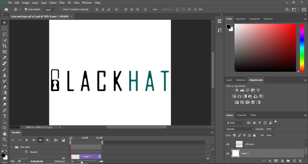
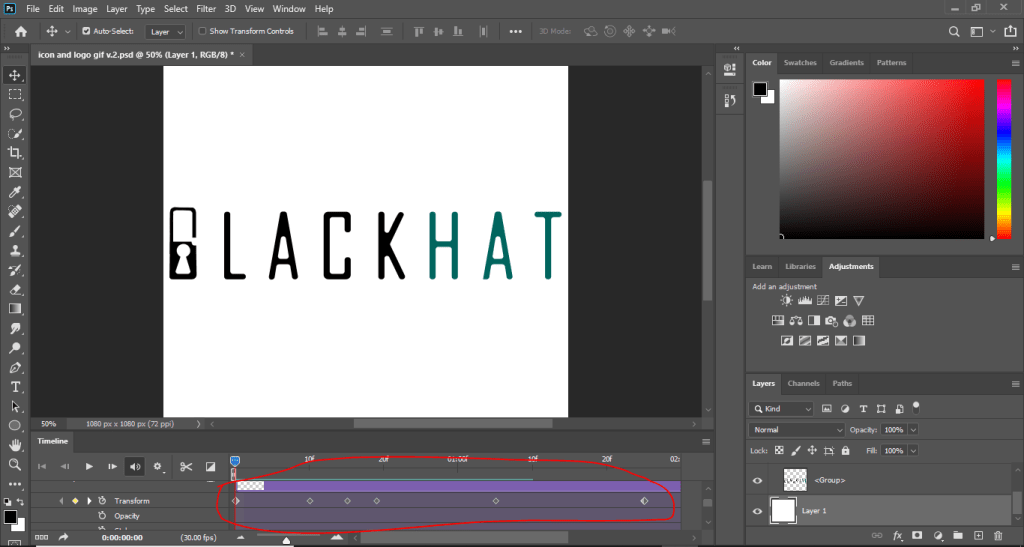
There are multiple ways of making animated gifs, you can use software such as Photoshop (which is what I used) or other adobe software such as animate, or premier. As you can see there is a timeline for this displaying the start to finish for the length of the video.
The dots in the transform timeline are pivot points which indicate where the action is supposed to start and finish. The pivots in the transform timeline means that I was using the transform action to move the lock object. This method is called in-betweening (or tweening as the animators on youtube would say), where you would get an object and transform (move) it giving it the Illusion of motion.
To export as an actual animation you first need to save for web. First go to file -> export -> save for web legacy, then where it says PSD change it to gif.
There are other ways to animate like frame by frame, and photoshop can do that but I’m not an expert on the frames portion of it, when it comes to frame by frame I would use another software. Here’s a video that will explain it better. https://www.youtube.com/watch?v=J2fy_iNFhFo. And the tutorial that I used is this https://www.youtube.com/watch?v=rbwQwDg8x0Y.
It’s not the ball animation tutorial that you will mostly see in animation tutorials, but it’s close enough right? Yes, good. So if you followed the tutorial you should have something that looks like my animation above. Now go create some nice business slides, cartoons, or memes or whatever you’re feeling.
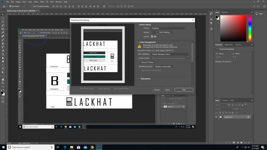
As we’ve went over before when printing anything, the color mode for print is CMYK and not RGB. Some programs can do this for you when you go straight to printing and you can set it to CMYK from there. But here’s how you do it before hand.
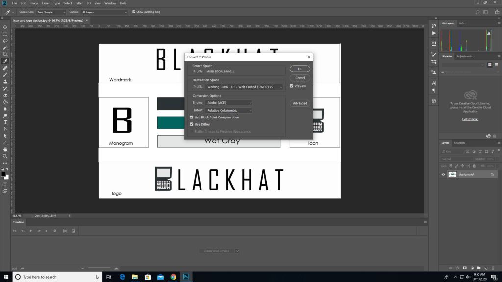
First you pull up an image on photoshop.
Then you go into edit -> convert to profile color then it will give you the option to change it to CMYK automatically depending on the printer you use.
Then as you can see the color mode changed from RGB to CMYK.
(This picture was made after converting the last image which is why the blue circle looks duller, product of converting) To print go to the file tab-> print, and you’ll see all these options. Where it says document profile it should say web coated (which is basically CMYK). Once you are done setting up hit print.
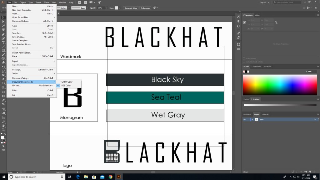
It works similarly in other programs such as illustrator as well but the placements are somewhat different.
In illustrator you need to go to file for this one.
In file find “document color mode” and choose CMYK instead.
And now it should say CMYK instead of RGB.
There are different programs that does this differently but the ways that they do this isn’t hard. Just go to file (mostly) and find the settings that convert to CMYK, you can even do it right before you print. Also if you see some type of warning telling you that the color isn’t supported for CMYK then click on the warning and it should set it to a similar but more well supported color pallet.
That’s basically it, it’s that simple. Now get out there and print something nice.
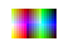
When it comes to designing, something to keep in mind are colors. Not which color you should use for your clothing design website, I mean which colors are safe for the web.
When it comes to the web, colors are made in RGB (reds, greens, and blues), and print (on paper) is made of CMYK colors (cyans, magentas, yellows, and blacks… yeah its black).
Web colors are specified as RGB triplet or hexadecimal format. Hexadecimal color codes are specified with notation using a leading # sign (not a hashtag).
In the mid-90s, many displays were only capable of displaying 216 colors due to the limited hardware.
Looks like windows 95 right? It basically is.
Nowadays our computers are capable of at least 256. Approximately 10% of the newest computers can only use 256 colors (8-bit). Others are equipped with 64 thousand colors (16-bit) and the highest quality deliver 16.7 million (24-bit).
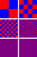
When it comes to web safe colors, one thing to keep in mind is dithering. If your computer doesn’t have all the colors available for the website then it will try to simulate the colors by mixing two or more available colors from the pallet to give it the illusion of the color making it look like it has spots.
ditheringnon-dithering
Windows 95 stuff that is.
Spot colors are CMYK colors (printing colors), and are generated by ink. CMYK does a similar proccess of mixing colors (solid) together to generate another; like cyan and magenta to make a blue or purple, or cyan and yellow to make greens. Today they are used for print, and are used by various printing companies, such as pantone. There’s really nothing that complex about CMYK, only that it’s used just for printing and only CMYK is what prints. You can’t use RGB to print unless you have an LED based RGB printer. You can preview what your picture looks like when you edit it in photoshop by looking in the previews before you print.
And now you know a little more about colors and the history behind them.
I’ve talked about jobs for multimedia before but now we’re gonna get into a bit more detail about the jobs and “the big moneys” that you can make.
In the last post I’ve said that you can work as a
digital camera operator
sound engineering technician
game designer
film/audio editor
multimedia artist
But other jobs include, but aren’t limited to
Game tester
photographer
installation artist
animator
game programmer
and much more might be introduced in the future.
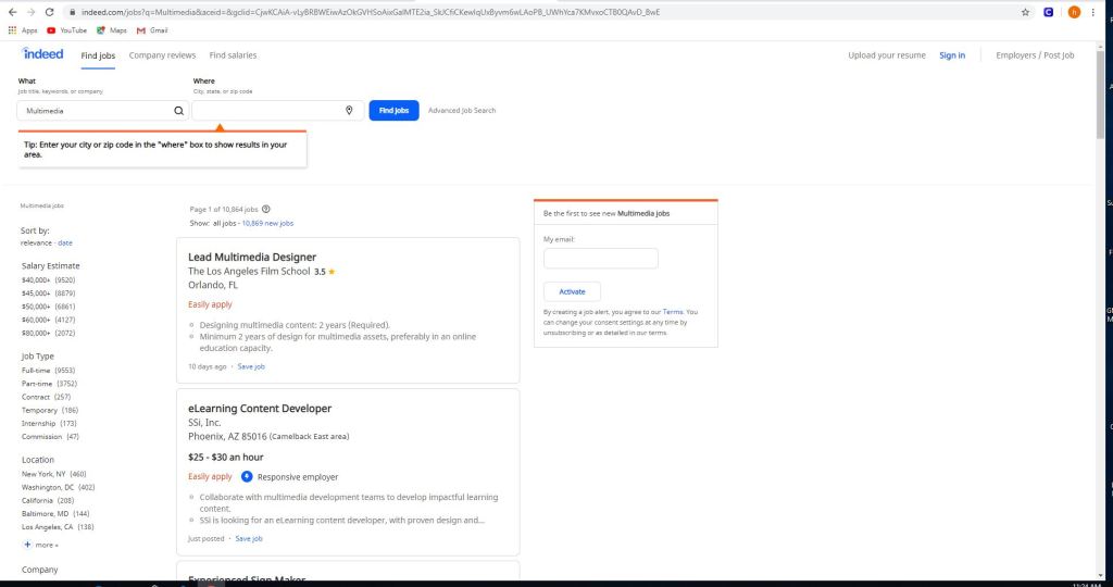
Some jobs on sites like indeed, and monster include but not limited to
eLearning content developer
experienced sign maker
multimedia and digital specialist
part-time video production technician
freelance editors
These jobs can be as small as $11 per hour up to $117,606 per year depending on the job.
Using sites like this is easy.
All you gotta do is use the left panel and check/uncheck what you’re looking for. Whether you want to get paid more, you want something closer to home or you want a more fulfilling job. There are of course search engines in these sites if you want something specific, but in order to really get something out of this it’s best to utilize all of the search capabilities, the search and the side bar.
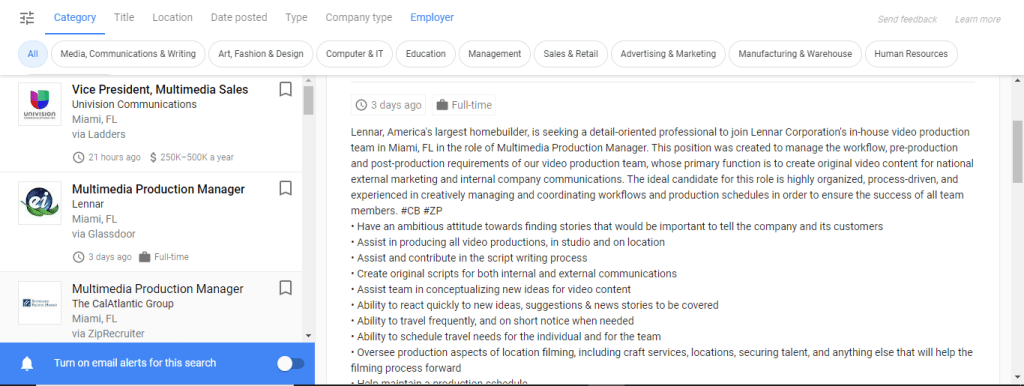
But the thing with these jobs is that they do have requirements.
Certain jobs will require a certain education or will require you to do certain things or to just plain work your way to the top. Some are full-time some are part-time and others are just free-lance. One of these is a multimedia production manager in Miami and for this you need
To have an ambitious attitude toward finding stories that would be important to tell the company and it’s customers.
Assist in producing all video productions, in studio and on location.
Assist and contribute in script writing proccess.
The requirements for this job include but not limited to
A college degree in film/video studies production
+2 year of video production experience
Must provide demo reel of previous qualifications
general knowledge of adobe creative cloud
microsoft office
knowledge of video cameras and basics
general knowledge of lighting for video production.
If you are interested in jobs like this you can check out zip-recruiter, indeed, monster or any job posting site like it. If you need to you can post your own job listings for your company as well; just go to the employers section, and post your job and wait for applicants.
Well now you know a little bit more about multimedia jobs and what you need to do for them. Now you can do what my parents said and GET A JOB.
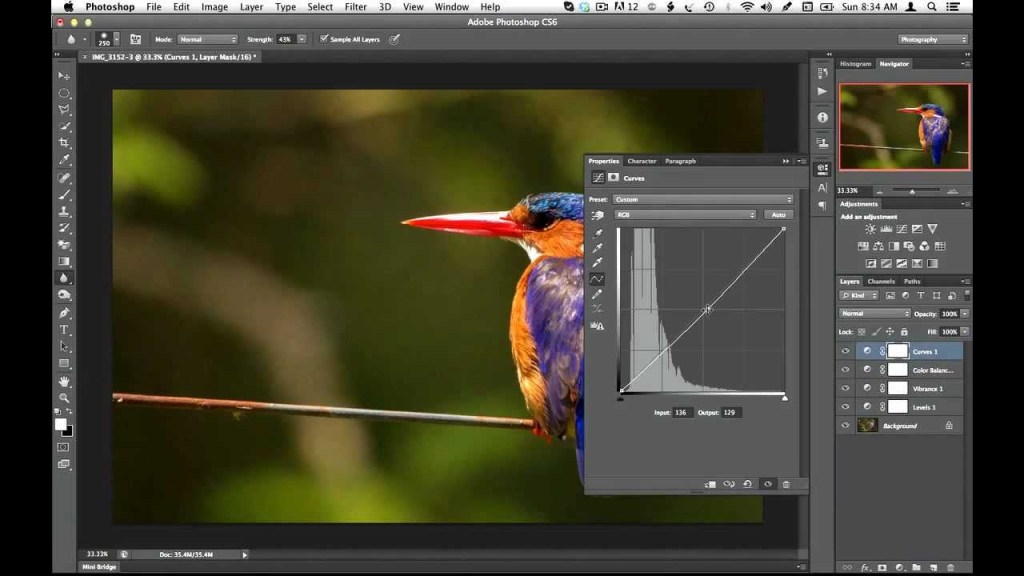
So when it comes to creating and editing in photoshop there’s so much you can do in it. No that’s not a “sky’s the limit” sentence, I literally mean there’s a lot of things you can do in this program, so much so that photoshop has different ways to edit. Think about this, you pull up an image and you want to change the color or make it darker/lighter, you can just change the hue/saturation or set the black&white tone but that will change the whole image. That is called destructive editing when you do that, you change the whole image and you can’t do much with it except undo. This happens because you save directly over the original image and now you can’t make changes to the original image.
Man you screwed up now, so what can you do about it?
Non-destructive editing (as seen as above) can save your life. This form of editing is what you can use to make changes to your picture without completely changing it. Applying a layer mask is a way of adding changes with out the change, basically “touching” it. Think of it as an edit “screen over the picture”. Use non-destructive editing for bigger, more complicated edits.
Vectors and rasterized graphics
Vector design, composed of shapes
Rasterized graphics (or bitmap images) are made by a map of bits within a rectangular grid of pixels or dots. Vector images are composed of lines, shapes, and other graphic image components stored in a format that incorporates geometric formulas for rendering image elements.
Vectors are math based and defined by paths so that they don’t look pixelated when scaled too much. These things are used best for logos.
The reason why you would rasterize a vector layer in photoshop is to properly use tools to edit images as some editing directions require you to rasterize, converting your images to pixels. This will happen when you want to do edits like change color using the paint bucket tool; you can still change the vector color using the properties tab but you still might need to convert for other editor tools.
Again there are a multitude of ways to use photoshop but the best way to use it is the way that you know how, and to avoid less heartache is by using non-destructive methods for serious editing.
And that is how I photoshop, how do you photoshop?
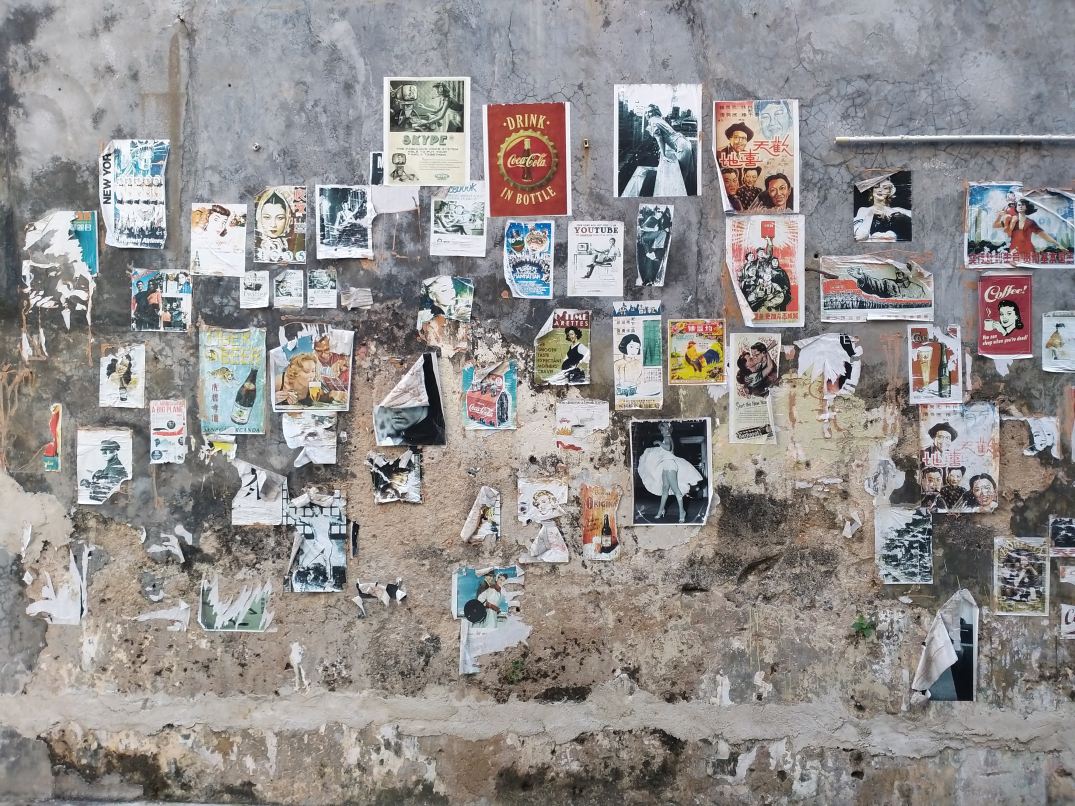
When it comes to businesses and idea pitching what comes to the rescue would be mood boards. These are simply collages of certain images, text samples, and objects in a composition. They can be random, but this is business, so it must be topical or you’ll just be spewing nonsense. The best way to make a mood board is to first know what it is you’re doing; that’s a given, and since you know what you’re doing you need to know this thing called: grouping. Grouping is putting items that go together,… together. Even if your mood board has a purpose without organization by grouping subjects together it will still look like nonsense. So group relevant topics together and it will look presentable.
Programs/Tools
So how do you make a mood board? Well you and literally build a mood board on the wall or on the floor; it will look terrible, but you could still make one like that if you choose. Some good tools to make some would be:
Powerpoint
Keynote (Apple’s powerpoint)
Google slides (googles free powerpoint)
InDesign (oldschool methods)
Pintrest (oldschool methods)
Personally I mostly use powerpoint, because it can organize my points using slides (also I use windows so I don’t use keynote). Google slides is just like powerpoint but it’s free and you don’t have to worry about saving documents because it’s saved in a cloud. And I don’t use pintrest or InDesign.
So remember this. In order to make a mood board, you need to get ideas together on a “board” but the best mood board is one that’s well organized. And remember you can use the programs I’ve mentioned but you don’t have to use them, you can literally do it on a wall (but I would advise not really doing it that way).